Final Report: CarbonCast — An end-to-end consumption-based Carbon Intensity Forecasting service
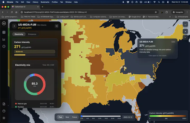 CarbonCast map with real-time data
Hi everyone—this is my final report for CarbonCast, mentored by Professor Abel Souza. Back in June, my goal was simple to say and harder to pull off: help people see when the grid is cleaner and make it easy to act on that information. Over the summer I turned CarbonCast from a research prototype into something you can open, click, and rely on: a containerized backend, a clean API, and a fast, friendly map UI.
Background
CarbonCast forecasts the carbon intensity of electricity (gCO₂e/kWh) using grid data and weather. Earlier versions were accurate but difficult to run and even harder to use outside a research context. My OSRE focus was to make CarbonCast usable for real people: provide a standard API, build a web UI that feels responsive, and package everything so it starts quickly and keeps itself healthy.
Goals
I centered the work around four goals. First, I wanted to ship an end-to-end containerized stack—data collection, validation, storage, API, and UI—that someone else could run without digging through my notes. Second, I aimed to expand coverage beyond a handful of regions so the map would be genuinely useful. Third, I needed to make it reliable, with retries, monitoring, and graceful fallbacks so the system could run for weeks without babysitting. Finally, I wanted to lay the groundwork for a consumption-based signal, because imports from neighboring regions also shape a region’s true emissions picture.
What I built
By the end of the program, CarbonCast runs as a containerized backend + API + web app that you can bring up with Docker. The pipelines now reach 85+ regions, and the UI currently exposes 58+ while we finish integrating the rest. The API offers straightforward endpoints for current conditions and multi-day views, plus region metadata so clients can discover what’s available. The UI presents an interactive choropleth map with a side panel for the energy mix and a simple timeline to move between past, now, and the next few days. To keep things feeling snappy, I tuned caching so “now” data updates quickly while historical and forecast views load instantly from cache. I also added a small “mission control” dashboard that shows what updated, what failed, and how the system recovered, which makes maintenance far less mysterious.
How it works
Fresh weather and grid data arrive on a regular schedule. The system checks each file for sanity, stores it, and serves it through a clean API. The React app calls that API and paints the map. Hovering reveals regional details; clicking opens a richer panel with the energy mix and trends; the timeline lets you scrub through hours naturally. In short, the path is fresh data → API → map, and each step is designed to be obvious and quick.
Behind the scenes, I extended the existing Django backend with a SQLite path so the UI works out of the box on a laptop. For production, you can point the same code at Postgres or MySQL without changing the UI. This choice made local testing easy while leaving room for scale later.
Highlights
A few moments stand out. The first time the dashboard flipped from red to green on its own—after the system retried through a wave of timeouts—was a turning point. Clicking across the map and getting instant responses because the right data was cached felt great too. And packaging everything so another person can run it without asking me for help might be the biggest quality-of-life win for future contributors.
Challenges
The first big hurdle was refactoring the old vanilla-JS interface. The original UI worked, but it was dated and hard to extend. I rebuilt it as a modern React + TypeScript app with a cleaner component structure and a fresh look—think glassmorphic panels, readable color scales, and a layout that feels consistent on both laptops and smaller screens. Moving to this design system made the codebase far easier to maintain, theme, and iterate on.
The next challenge was performance under real-time load. With dozens of regions updating, it was easy to hit API limits and make the UI feel jittery. I solved this by adding a smart caching layer with short, volatility-aware timeouts, request de-duplication, and background prefetching. That combination dramatically reduced round-trips, essentially eliminated rate-limit hits, and made the map feel responsive even as you scrub through time. The result is a UI that can handle many simultaneous updates without hiccups.
Finally, there were plenty of stubborn UI bugs. Some regions wouldn’t color even when data was available, certain charts refused to render, and a few elements flickered or never showed up. Most of this came down to learning React state management in a real project: taming race conditions, canceling in-flight requests when users navigate, and making sure state only updates when fresh data actually arrives. Fixing those issues taught me a lot about how maps re-paint, how charts expect their data, and how to keep components simple enough that they behave the way users expect.
What didn’t make the cut (yet)
I designed—but did not finish—per-region plug-in models so each grid can use the approach that fits it best. We decided to ship a stable, deployable service first and reserve that flexibility work for the next phase. The design is written down and ready to build.
Links and resources:
- Project page: CarbonCast
- Proposal: https://ucsc-ospo.github.io/report/osre25/ucsc/carboncast/20250710-tanushsavadi/
- Midterm blog: https://ucsc-ospo.github.io/report/osre25/ucsc/carboncast/20250803-tanushsavadi/
- Backend/API (branch): https://github.com/carbonfirst/CarbonCast/tree/django_apis_sqlite
- Frontend/UI: https://github.com/carbonfirst/CarbonCastUI/tree/main
What’s next
My next steps are clear. I want to finish the per-region model plug-ins so grids can bring their own best forecasting logic. I also plan to carry the consumption-based signal end-to-end, including imports and interconnects surfaced directly in the UI. Finally, I’ll harden the system for production by enabling auth and throttling and by moving to a production-grade database where appropriate.
Thank you
Huge thanks to Professor Abel Souza for steady mentorship and to the OSRE community for thoughtful feedback. The most rewarding part of this summer was watching a research idea become something people can click on—and use to make cleaner choices.
Tanush Savadi
GSoC 2025 Contributor
Tanush Savadi is a rising senior at the University of Massachusetts Amherst studying Computer Science and Mathematics. As a GSoC 2025 contributor with UC OSPO, he is developing an API for CarbonCast to help individuals and organizations access and act on real-time carbon intensity forecasts.